Open banking with personalization

Though Finastra is one of the largest fintech companies in the world, it still operates as a disruptor. The software and service giant continues to innovate and change the way banking software is developed and deployed globally. Since our first engagement to develop a Drupal-powered dev portal in 2018, our work together has progressed, ultimately culminating in a complete transformation of Finastra’s main dot com into an innovative fintech experience.
Finastra has long been a fintech leader and pioneer within the emerging banking-as-a-service space (BaaS). Its commitment to “open banking,” (working with institutions and developers to build better financial tools) aligns with the spirit of open source and our own commitment to its use.
After completing a 2021 brand refresh as a prelude to a new marketing initiative, Finastra was ready to transform its digital experience online. Our goal was to fully embrace a customer-centric approach and align the experience with the user, to simplify navigation, content, and information architecture, and incorporate the latest UX best practices, B2B marketing strategies, and Drupal technology to help Finastra continue to grow.
OPEN BANKING MEETS OPEN SOURCE
While Finastra had already embraced the value of open source and Drupal, their previous site was cumbersome to use and expensive to maintain. Finastra produces a lot of content across verticals and solutions, and one of a CMS’s primary uses is to, well, manage content.
But Finastra’s output had outgrown its tools and it not only needed a fresh approach to managing content on the backend (for the sake of product and marketing managers) but it also needed to present the content in a clear, digestible way for users. More for more’s sake is rarely useful, and our challenge was to narrow and only show customers what they needed to know at any given stage.

BANKING ON SIMPLIFICATION
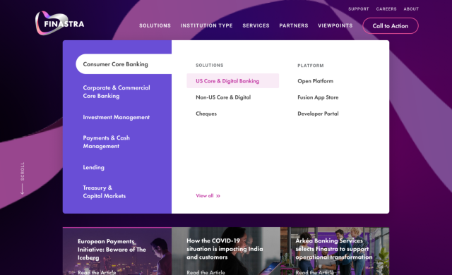
With a footprint and product portfolio as vast as Finastra’s, it’s easy to let buckets and silos define a site’s navigation. But Finastra believed in the power of simplicity, and so do we. Our challenge was to see just how far we could go paring down the navigation while still communicating all that Finastra does.
A few rounds of navigation workshops informed by stakeholder discovery and user research produced clear categories that aligned with the business’ focus and user terminology. This is always a balance between what a business wants users to know, and what users think they need.
The new nav is segmented into large solution groups while limiting and prioritizing menu items within each to prevent users from becoming overwhelmed.

INVESTING IN USER EXPERIENCE
We see common problems based on years of working with enterprise B2B organizations, and we have an arsenal of proven solutions to fix them. A single-page conversion approach, for example, (depending on the user’s stage in their journey) ensures that everything a user needs to make their first decision is on the page.
Multiply this approach across entire sections of the site and you have dozens, hundreds, of high-performing pages rather than an imaginary “path” that users should take (spoiler, they won’t). With this approach, Finastra’s users find what they need, whether they’re coming from organic search, paid campaigns, or from the homepage.
DESIGN PAYING DIVIDENDS
With solid UX in place, Finastra wanted to bet big on a new look and feel. This was about a brand refresh, after all. But like other projects we’ve done where a brand has been defined but not tested, Finastra had room to explore.
While fintech has a reputation for conservative design, Finastra’s new look embraces drama and moody excitement. It’s bold (and not in the bland blue and gray corporate sort of way). But Finastra’s design system is not just about pretty colors. For example, contrast is used sparingly to call attention to the right elements. If everything within a design is shouting to a user, everything becomes noise.

FINANCIAL CONTENT MANAGEMENT
A primary goal for the new site was a better content management experience for marketers. Once again, we used Paragon, our open-source Drupal distribution for B2B, which provides drag-and-drop editing, easy media management, and a clean UI out of the box. Simple, reusable content components leverage complex underlying taxonomy relations to tie content to solutions, themes, regions, etc., which are all managed automatically. Admins write, tag, and post content and the Drupal site ensures it gets where it needs to go.

ACCOUNTING FOR PERSONALIZED CONTENT
While the concept of anonymous web personalization is a staple among marketers, B2B companies still struggle to make it a reality. Even with Drupal, where tools like Smart Content exist to enable real-time personalization, there are challenges beyond technology—this is where strategy becomes key.
For Finastra, our personalization approach centered on helping a user navigate the vast amount of resource content available. We could not simply list every resource and hope for the best. Instead, we developed what we dubbed the “Viewpoints Explorer.” Embedded across the site, this “smart library” remembers the topic of interest a user-selected. The saved topic follows the user around the site and merges with the subject of the existing page to display a small set of hyper-relevant content.

STRONG FOURTH-QUARTER RESULTS
Working alongside Finastra’s international team of brand managers, product owners, digital marketing experts, and content teams, we’ve unveiled a totally reimagined Finastra.com that fully embraces Finastra’s new brand and its vision for the future. Content, user experience, and the Drupal foundation powering the site were built from the ground up to help Finastra attract customers across the globe, educate buying teams, and ultimately help the business grow.
increase in contact forms
increase in gated content forms
increase in users via organic search