Driving Web Conversions
Simplifying lead gen with Drupal for Origami Risk

Provider of SaaS software for the risk & insurance industry

38%
Increase in contact form submissions
298%
Increase in resource-center engagement
70%
Increase in demo request form submissions
Origami Risk is a leading provider of integrated SaaS solutions for the risk and insurance industry. They serve the needs of multiple sectors: healthcare, construction, retail, manufacturing, and many more.
But these user journeys were scattered, and Origami Risk needed an integrated Drupal site focused on conversions—which is why they reached out to experts at Elevated Third.
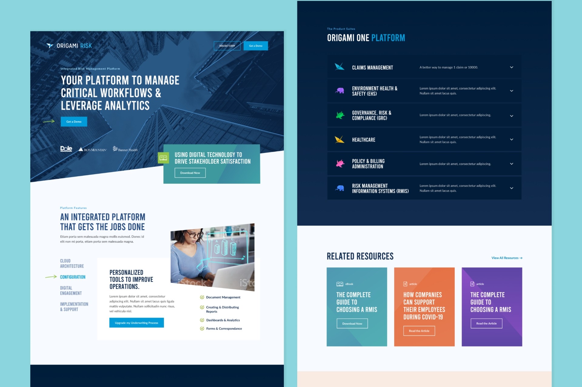
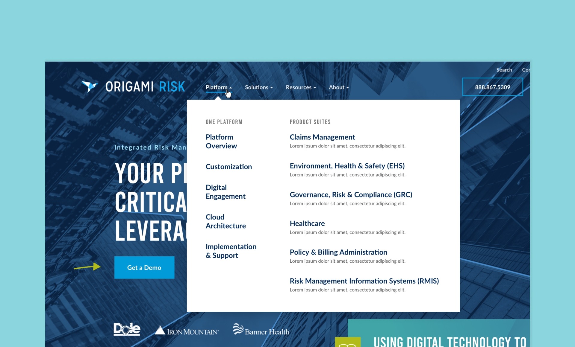
Within complex user journeys, multiple audiences (who may use the same products in completely different ways) struggled to reach the right place for them on Origami Risk’s site. Because each user may describe their needs using similar terms, sending users to relevant solutions was a significant navigational challenge. Intercepting users, and directing them to the products and services that align with their business needs, was critical—while also highlighting that Origami Risk solves a variety of risk problems.
Information Architecture
Revamping information architecture to make content clear
A complex (and redundant) set of product suites confused users and obscured calls-to-action, so our primary goal was to get users to the right information. After that, we needed to support marketing efforts to build Origami Risk’s reputation while nurturing leads through an often long sales cycle.
The first order of business was to completely revamp the product architecture, organizing information into more digestible, clear product suites. Origami Risk's industry is complex, and so are the needs of their users. We incorporated persona data and developed top-level themes to better tailor the site towards their ideal customers.
Collaboration on a card-sort activity helped organize existing products into a new schema, and led to new solution pages tailored to relevant users and key business lines. Whether a risk manager in the construction industry or a VP in the health space, Origami Risk has site visitors covered.

Website Structure
A site built for its users, with clear navigation and flexible design
When a new visitor reached the site, we needed to communicate value overall while helping them reach what they needed—hence, a navigation that allows users to explore the site in different ways. Product-suite pages are for products, or groups of products. Solutions pages are for use cases, or for problems we solve. By implementing both, we let users explore both sides of the same coin. Whether you look for products that help you achieve a business outcome, or business outcomes that you can achieve via products—you're covered. These navigation concepts were validated with both SEO research and tree testing for performance.
A flexible design system tells the product story via efficient, compelling content “chunks” that respect users’ time and are manageable for Origami Risk’s marketing team. Starting from scratch, we went through several rounds of design reviews to align on concepts that were exciting, but still user-friendly. It was important to be simple, but not stark. Minimalism with ample white space allowed the site to breathe for an easier user experience, since the industry is complicated enough.

Post-site launch, we saw resource-center engagement (a priority for the Origami Risk team) jump nearly 300%, plus a 70% increase in demo requests. The updated website made navigation easier for users, delivered an aesthetic refresh to match the new direction of their brand, led to a substantial increase in meaningful conversion metrics.
Not ready? See how we approach improvement engagement.