UX Design Agency
The only good digital experience is one that compels and converts.
The only good digital experience is one that compels and converts.

Effective B2B websites deliver great experiences and drive pipeline.
A B2B website that looks good is not enough—it has to perform. With a conversion-focused B2B website strategy, you can simplify your approach, focus on what truly matters, and see measurable growth.
By leveraging proven B2B UX design conventions, crafting highly engaging content, and integrating cutting-edge personalization tools, we create websites that work harder for your business. Our approach to UX design services focuses on clear, impactful user journeys that align with your customer’s decision-making process, make and impact, and deliver ROI you can measure.
B2B UX Design
A different approach for tomorrow’s B2B UX demands.
A different approach for tomorrow’s B2B UX demands.
No need to start from scratch with high-performing UX standards.
Proven B2B UX conventions ensure clarity, consistency, and results—saving the creative muscle for content that matters.
B2B UX has one job: to deliver the compelling content buyers need.
We go beyond drawing boxes to produce clear, impactful content that solves problems and leaves an impression.
Design systems for marketers with sustainable flexibility.
No more over-designed sites that are hard to use or change, or underwhelming sites to which you avoid sending traffic. We strike the balance between "easy on the eyes" and "easy to use" that you need to keep moving.
Clarity over complexity
Better for B2B UX is not about making better boxes in Figma
Better for B2B UX is not about making better boxes in Figma
Good design doesn’t always mean good UX, especially in B2B marketing. Effective UX prioritizes simplicity, clarity, and messaging tailored to the buyer's needs at each stage of their journey. Buyers visit with clear goals—understanding services, solving pain points, or exploring pricing—and great B2B UX design delivers what they need without unnecessary complexity.

Primed to perform
Performance-driven websites with everything you need, and nothing else.
- B2B Website Strategy & UX based on proven B2B patterns and backed by CRO, to guide buyers toward conversion—not reinvent the wheel.
- B2B Brand Activation, Content & Design to deliver impact beyond layout. We combine visual design, content and interaction for impactful brand moments.
- SEO & Paid Media Strategy to ensure your traffic strategy and web experience align seamlessly.
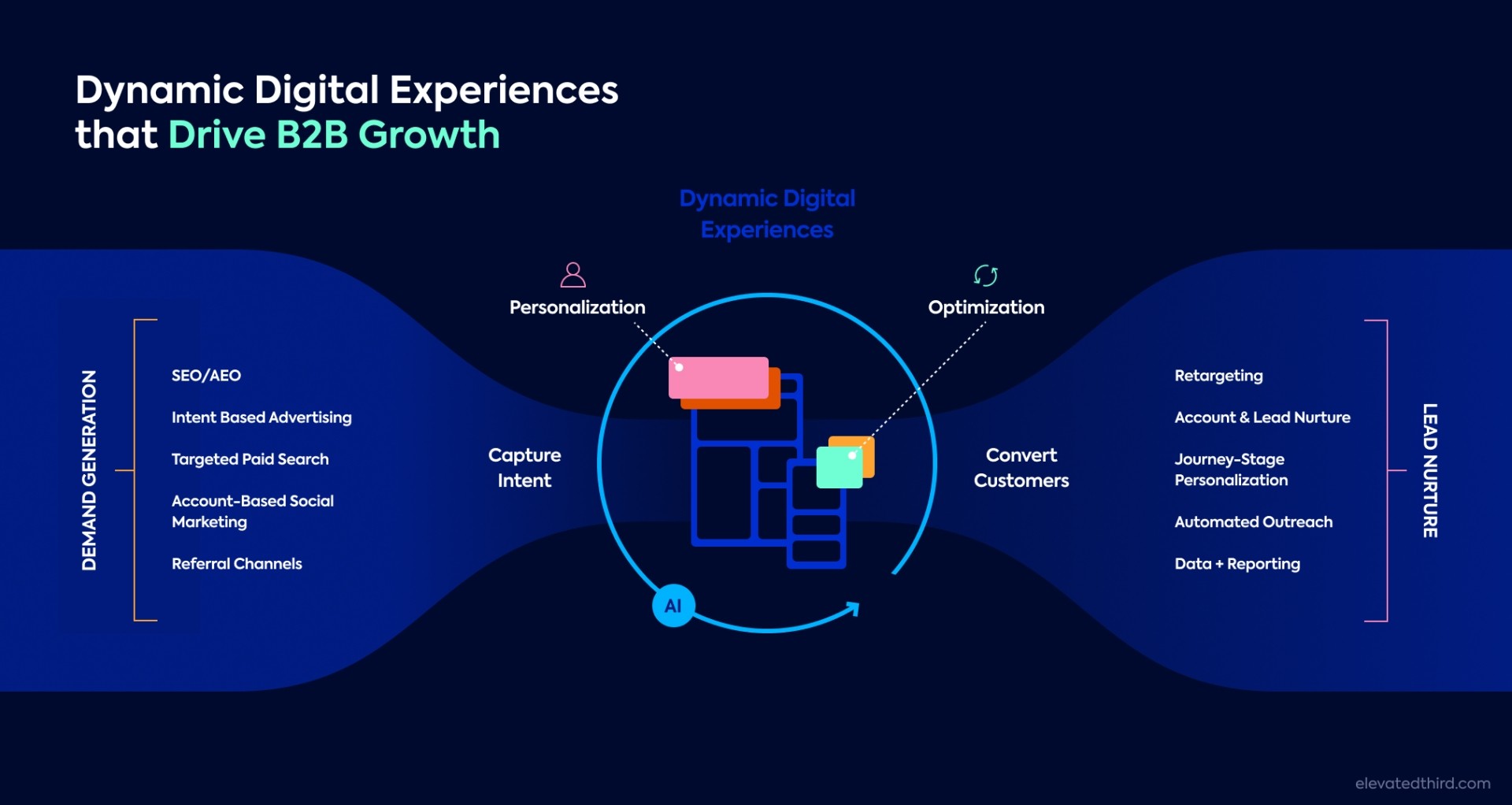
- Web Personalization with integrated tools like 6sense and VWO to create tailored experiences for every account and buyer.
Personalization should come standard
Your prospects want solutions to their specific challenges, and they are starting to expect it. With tools including ABM platforms such as 6sense, personalization engines like Mutiny, and A/B testing tech like VWO, tailoring your messaging becomes easier and more targeted. Remember, personalization creates resonance. When visitors arrive at your site, they should feel, “This brand gets me.”
Good UX and design should be measurable
Vanity metrics like bounce rates and session time offer limited insight. To truly measure impact, connect web UX design for B2B to business outcomes like lead generation and revenue. If it’s not converting, it’s not working.
See our approach to incremental improvement


